UX Google Play Store recommendations
By Anders Olsen Sandvik on
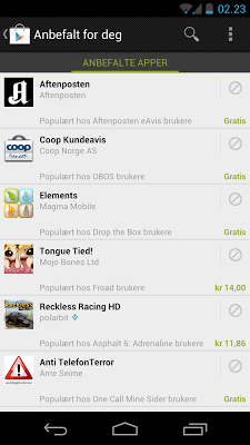
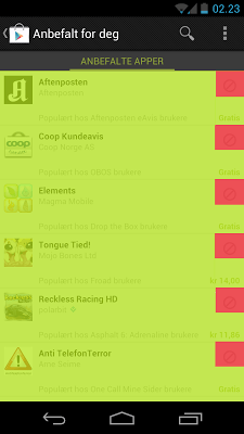
Google recently launched "Recommended for You" for its Android platform. Personally I believe this is a nice feature because it's hard to find apps other than top sellers or from similar lists in the Android store. From what I can tell it uses lots of different information everything from what your friends like, similar users like, regional users and users that downloaded others apps you did too. From a rough calculation Google decided to use around 6%1 of the area given to each app for the "remove" button. I believe this area is too small and it makes it too hard to hit the button. I suggest it will be more user friendly to make the pressable area 4x as big.
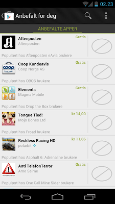
Some reasons why they might have chosen to make the area as small as they did might be to get space for the reason they recommend the app to you. Or the length of the app name combined with the size of the price. Either way I believe that the functional design of the button is at a loss when hit multiple times. The way I see it is that the recommended app has three states. The app being ignored, wanting to install it or removing the recommendation. Right now Android is giving 94% of app space to the wanting to installed action while the remove recommendation is given a lot less. One might argue that the designers want people to install more apps and have left the split this way for that reason. If so I think it was not the right decision. There is also a lot of important information in the user taking the step to remove a recommendation. This action can be used to fine tune future recommendations to find even better recommendations for the user.
The pictures are taken with my Samsung Galaxy Nexus and my computer and are taken with the store set to my native language Norwegian. But I assure you they are not very different in English.


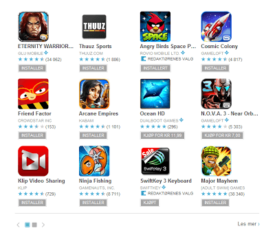
Oh, and when we are on the subject I'm really not impressed by the way the Google Play Store differentiates between applications you have bought, installed, is free or can buy. The boxes used to display this information are too similar. In the case where there is a free app and a installed app there are only two letters separation the two states. Some ways you can differentiate is by giving the different states different colors. In this case let light blue be the color of installed apps, the standard Android green for apps that can be bought and are free and keep the gray for bought but uninstalled applications. Somehow I imagine the reson why the Android Team diden't want this solution was to keep away from having lots of colors. This is not functional design and lessens the user experience. Another way to seperate the states could be to add a small phone icon to applications that are installed. That way you can keep the same color scheme but the apps that are installed will be esily reconisable by the small phone icon. Now some people will argue that Android is about more than phones. Android is in tables, cameras and even in cars. But I'm pritty sure you can design an icon that represents all of these.

1. Calculating the size
Size of lime area 720 px _ 160 px = 115 200 px Size of red area 80 px _ 80 px = 6 400 px 6 400 px / 115 200 px = 5,55%