CSS box model
By Anders Olsen Sandvik on
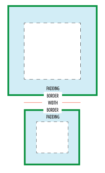
If you have ever played around with CSS you might have used margin and padding to adjust space around different elements. In the browser every element is basically a box and CSS has something called a box model. The default box model is not very intuitive. If you set the width or height of an element to 100px you would expect that element to be that size. With the default box model however the border and padding values are moved outside the element's box and expand past it's size. By using border box the border and padding values are moved inside the element's box, cutting into the width and height of the element rather than expanding it.
This box model is definitely easier to work with on more responsive and fluid designs. Here is a code snippet with the latest box-sizing best practices. The inherit part is added so you can have components on your page that easily can use a different box model.
html {
  box-sizing: border-box;
}
*, *:before, *:after {
  box-sizing: inherit;
}
Both Paul Irish and Marie Mosley has some great write-ups on border box that you should check out.
@muanchiou has written about how this can be introduced on a large site like Github. This was possible because they could feature toggle this change to just small a group of people with team-ship or something like Unleash.